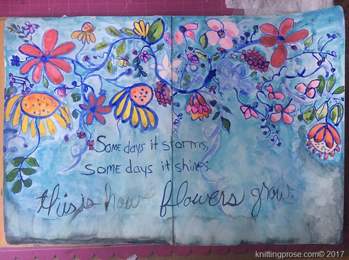
In my Wanderlust 2017 art journal I did some watercolor painting. This class was taught by Wilna Furstenberg. She had a casual pace and open flow style. It was very relaxing to just sit and make flowers, not really thinking about what went where or if it looked proper and perfect or not. I just wandered along the page and made flowers as I went.
Making Flowers
“Some days it storms, some days it shines. This is how flowers grow.”
I started the page with a super thin layer of gesso. Wilna suggests this and applied it with card like a putty knife, spreading it thinly and cleaning up the edges. I like the way the watercolors laid on the paper without soaking in.
For my “Let the Paint Speak” class, I have two projects to share.
Shine
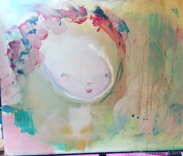
The process for this particular painting was a little different for me. After just the first “round” of laying down paint and getting the basic face, I was in love.
There is still apart of me that wishes I’d stopped right here. I love the lightness of her face and the flowers crowning her head. But alas, I continued on…
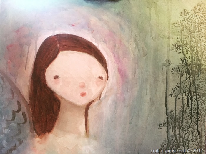
Here I added the wings and the girl started taking more form. I also added a tree to the right. A little more work after all this and something was missing.
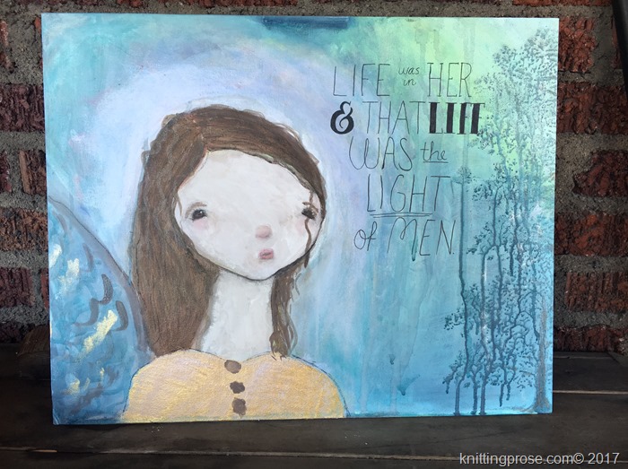
I decided to add the words and she felt complete. I like the way her face turned out after all. There was a bit of experimenting in her hair. I had a beautiful dark brown Color Bloom Spray and I used that to add texture to her hair. I just sprayed the ink into a tray and painted it on. It looked so nice I ended up using it in several places.
Sail
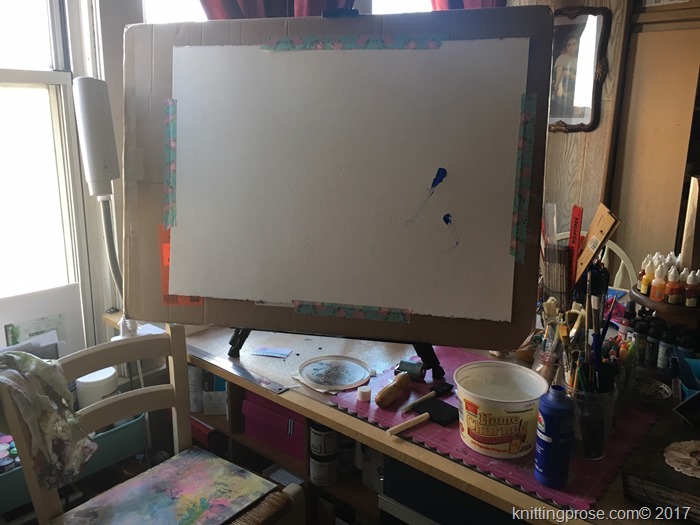
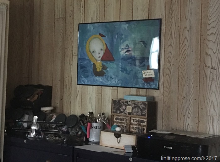
My biggest painting yet, Sail was created on a piece of watercolor paper, 22” x 30”. It just barely fit on my table top easel.
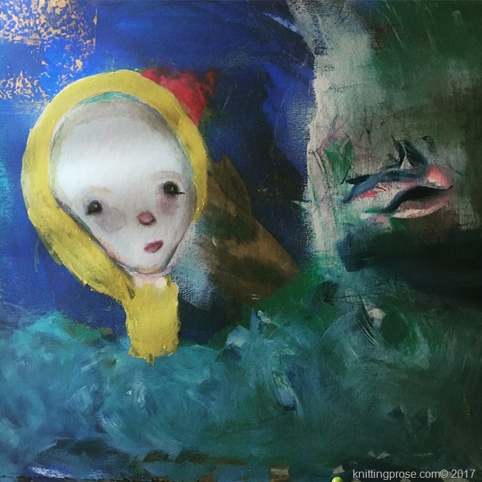
I’ve definitely settled on some favorite colors during this series of classes and the top few are shades of blue. Continually, I reach for the same few colors over and over again. This painting has lots of blues in it.
Tim Holtz Distress Crayons for the win!
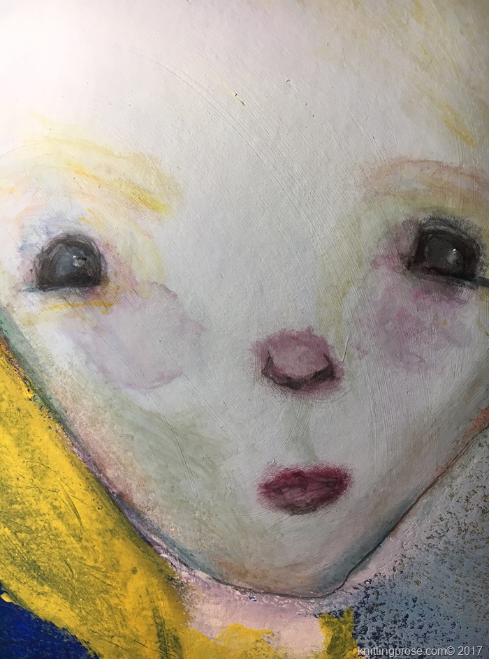
I experimented with Tim Holtz distress crayons on the face and they created some beautiful colors and shading. Not sure why I haven’t used these before since I love pretty much everything Timmie. The other day, I caught a Facebook Live demo where he talked all about their properties and how he uses them and I thought to myself, “that’s exactly what I need!” So, I gave them a go and the results were so wonderful. Here’s a closer look.
These definitely call for some more play and experimentation. So far, I love the results I’m getting.
She Threw Her Fear in the Sea of No Cares
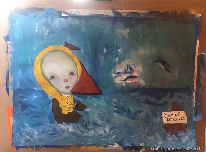
At this point, I knew exactly where this little girl was going and what she was up to. Her creation was inspired by a song from one of my all time favorite bands, Great Big Sea. This whole art journey is about tossing fear overboard and learning to go with the tide, as the song says, so I thought it was only appropriate that she be out in the boisterous sea unloading her fears.
This little girl is so big that I didn’t quite know what to do with her. Rolling up the paper wasn’t an option so luckily I got a 60% off coupon from Michael’s and got her a cheap frame.
Not the fanciest get-up around, but at least she’s protected. And she’s the first one to get a frame. (not counting that landscape I painted back in grade school)
This is a fun journey. Challenging, frustrating sometimes, but lots of fun and joyful. Til next time…
